Build a Homepage from Scratch
 View Project
 View Code
 Clone Project
What you will get from this workshop
- A simple but good looking homepage that you can extend
- A list of resources for further help and continued learning
Tutorial Content
- About the project
- Create an account
- Our Strategy
- HTML: Creating out layout
- CSS : Styling our layout
- HTML : Mobile layout
- HTML/CSS: Creating the Navigation
- HTML/CSS: Creating the Header
- HTML/CSS: About section
- HTML/CSS: Footer section
- HTML/CSS: Portfolio section
- HTML/CSS: Contact section
- List of Resource
About the project
In this workshop you will learn how to build a simple webpage that you can easily extend as you learn new skills.
While building your home page in this workshop, you will learn the following
- HTML
- Semantic Elements ⇒ Creating html code that is easy for humans and machines to understand
- Form Element ⇒ Creating a web form so people can contact you
- CSS
- Box Model ⇒ Practice using the box model to make sure things are spaced out aesthetically.
- Flex Box ⇒ Practice using flex box to make sure things are laid out aesthetically.
- Javascript:
- Importing Projects ⇒ Turn your projects into an interactive portfolio
Creating your account
- Go to https://www.qoom.io
- Click the
Sign Upbutton - Follow the instructions
Our Stragegy
There are two strategies one can use to create a web site:
- Build from Template: Find a site you like, copy it and then change it to your liking
- Build from Scratch Strategy: Create/Find a design of what you want to create and then create it using code.
We are going to be employing the Build from Scratch Strategy in this workshop. These are the steps:
- Create the layout in HTML
- Style the layout in CSS
- Make sure all looks good in Mobile
- Repeat steps 1 - 3 for each section of the layout.
- Add project gallery
- Add contact form
HTML: Creating our Layout
Looking at our design, we can divide it up into various sections like:
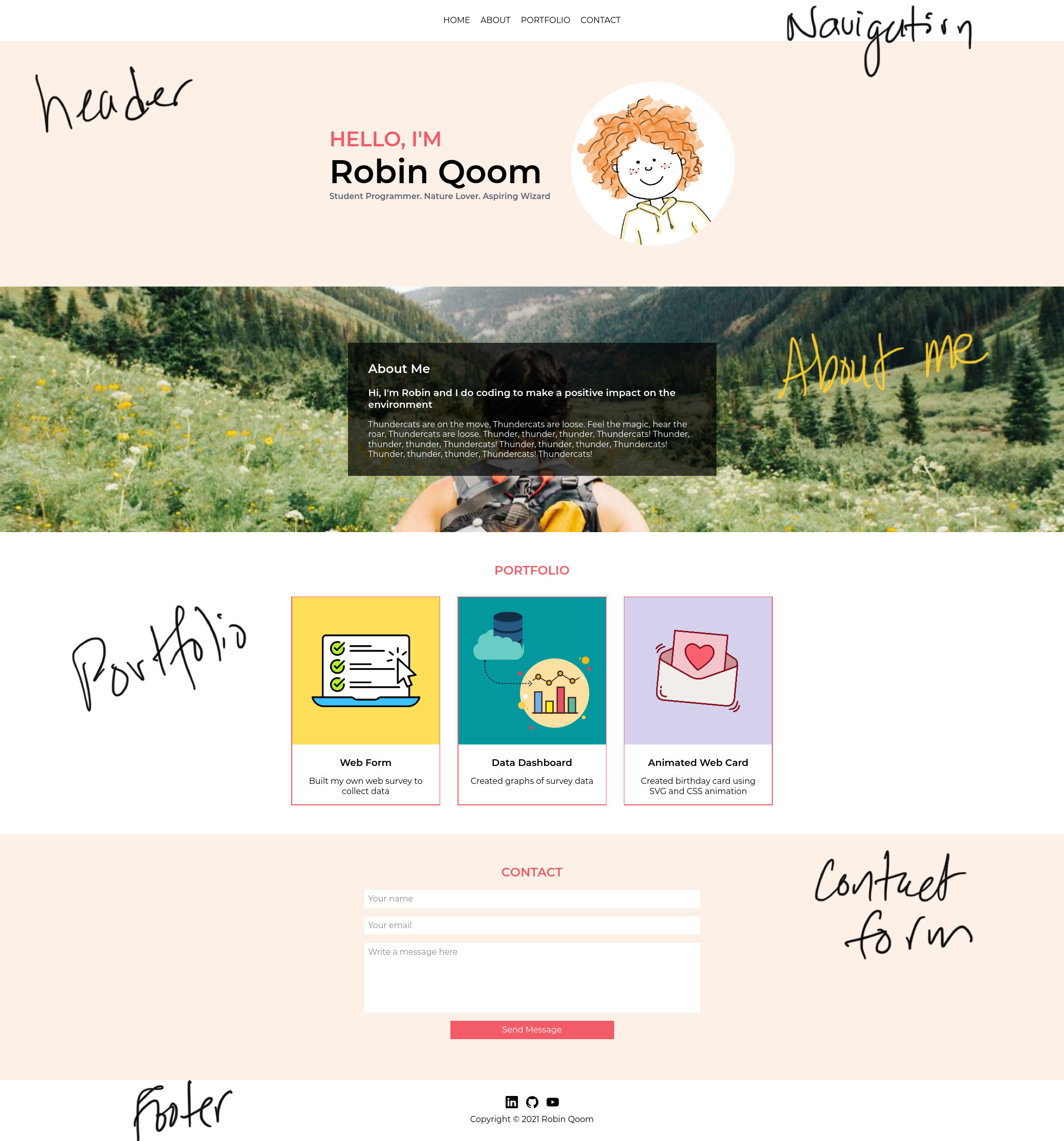
Translating this into HTML is pretty straight forward:
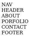
- Create an element for each section:
- We just need to use a semantic tag if one exists, otherwise create your own using the
sectiontag and itsidattribute. - You can see if a semantic tag exists here
- We just need to use a semantic tag if one exists, otherwise create your own using the
- Put any word inside these elements, so that we can see them until we replace them with the actual content
<body>
	<nav>NAV</nav>
	<header>HEADER</header>
	<section id='about'>ABOUT</section>
	<section id='portfolio'>PORTFOLIO</section>
	<section id='contact'>CONTACT</section>
	<footer>FOOTER</footer>
</body>
Now our site looks like this:
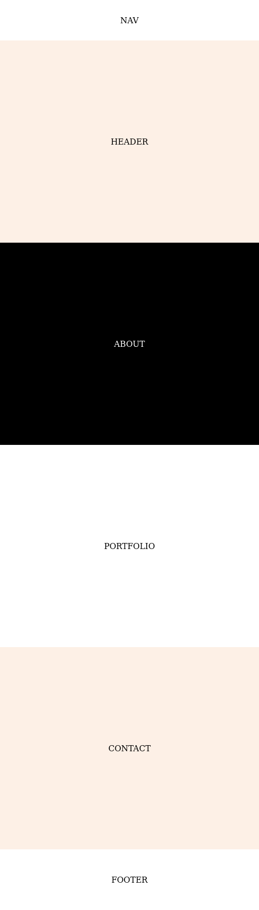
CSS: Styling our Layout
In order to make sure we build a good foundation we are going to style what we created so far, before adding more details. We are going to just focus on the position, size, and color of each section.
We can handle the position just by styling the <body> element, using flex-box and the css box-model:
body {
	/* FLEX BOX PROPERTIES */
	display: flex;
	flex-direction: column;
	align-items:center;
	justify-content:space-between;


	/* BOX MODEL PROPERTIES */
	margin: 0;
	padding:0;
	min-height: 100vh;

}
To learn more about the box-model go here.
To learn more about flex-box go here.
Let's now color and size each section:
body {
	/* FLEX BOX PROPERTIES */
	display: flex;
	flex-direction: column;
	align-items:center;
	justify-content:space-between;


	/* BOX MODEL PROPERTIES */
	margin: 0;
	padding:0;
	min-height: 100vh;

}

nav {
	color:black;
	background-color: white;
	height:80px;
	width:100%;
}

header {
	color:black;
	background-color: #fdf0e6;
	height:400px;
	width:100%;
}

#about {
	color:white;
	background-color: black;
	min-height:400px;
	width:100%;
}

#portfolio {
	color:black;
	background-color: white;
	min-height:400px;
	width:100%;
}

#contact {
	color:black;
	background-color: #fdf0e6;
	min-height:400px;
	width:100%;
}

footer {
	color:black;
	background-color: white;
	height:120px;
	width:100%;
}
Exercise:
Addflex-boxproperties to each section's css so that the content is in the middle of each section.
Here is the css to put the content in the center:
display:flex;
align-items:center;
justify-content:center;
When you are done the page should look like:
HTML: Mobile Layout
Now let's take a look on the mobile phone. To load your page on a mobile device:
- Click the
QRcode button in the editor - Scan the code on your mobile device
- Device should open the page on your device automatically.
You might notice the font is really tiny. Let's fix that by adding the following meta tag to the top of the head element:
<meta name="viewport" content="width=device-width, initial-scale=1">
Now refresh the page on your device and see the font size looks reasonable.
You can learn more here
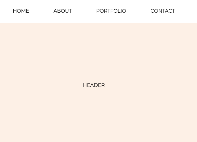
HTML/CSS: Creating the Navigation
First lets update the html to include the navigation links. To navigate to an element, it needs an id like so:
<nav>
	<a href="#header">HOME</a>
	<a href="#about">ABOUT</a>
	<a href="#portfolio">PORTFOLIO</a>
	<a href="#contact">CONTACT</a>
</nav>
<header id='header'>HEADER</header>
Next let's make sure the navigation elements spread evenly across the top:
nav {
	color:black;
	background-color: white;
	height:80px;
	width: 100%;

	/*Stretch the distance between elements to fill the width*/
	max-width:600px;    			 /* Prevents the elemens from stretching too far */
	justify-content:space-around;    /* Automatically stretches the elements*/
	flex-wrap:wrap;                  /* If mobile, makes the elements wrap for accesibility */
}
Now we can style each navigation element:
nav a {
	/*Customize <a> tag style*/
	text-decoration: none;
	color:black;
	margin:0 12px;
}

nav>a:hover {
	color: #F45B69;
}
Exercise:
Choose a font from google: https://fonts.google.com/
When done, add the appropriate link tags to the html's head element:
<link rel="preconnect" href="https://fonts.gstatic.com">
<link href="https://fonts.googleapis.com/css2?family=Montserrat:wght@400;600&display=swap" rel="stylesheet">
And then specify the font-family in the body { ... } selector, so that it gets applied everywhere:
font-family: 'Montserrat', sans-serif;
When finished your site should look something like this:
HTML/CSS: Creating the Header
Again let's begin by adding the elements that describe the layout:
<header id='header'>
	<div>
		<h2>Hello, I'm</h2>
		<h1>Robin Qoom</h1>
		<h3>Student Programmer. Nature Lover. Aspiring Wizard</h3>
	</div>
	<img src="assets/profile.png">
</header>
Exercise:
- Upload a picture
- Change the text
- Use CSS Box Model and Flex Box to style the contents
Here is the CSS that I used:
header {
	color:black;
	background-color: #fdf0e6;
	height:400px;
	width:100%;
}

header {
	background-color: #FDF0E6;
	display: flex;
	flex-direction: row;
	align-items: center;
	justify-content: center;
}

header h1 {
	font-size: 64px;
	margin: 0;
}

header h2 {
	font-size: 40px;
	margin: 0;
	color: #F45B69;
	/* Make all of the characters to uppercase*/
	text-transform: uppercase;
}

header h3 {
	font-size: 16px;
	margin: 0;
	color: #5E616E;
}

header img {
	width: 320px;
	height: 320px;
	background-color: #fff;
	border-radius: 100%;
	margin-left: 40px;
}
Exercise:
- Check Mobile and Fix Things
HTML/CSS: About Section
Again let's begin by adding the elements that describe the layout:
<section id="about">
	<div>
		<h2>About Me</h2>
		<h3>Hi, I'm Robin and I do coding to make a positive impact on the environment</h3>
		<p>Thundercats are on the move, Thundercats are loose. Feel the magic, hear the roar, Thundercats are loose. Thunder, thunder, thunder, Thundercats! Thunder, thunder, thunder, Thundercats! Thunder, thunder, thunder, Thundercats! Thunder, thunder, thunder, Thundercats! Thundercats!</p>
	</div>
</section>
Exercise:
- Upload a picture
- Change the text
- Use CSS Box Model and Flex Box to style the contents
Here is the CSS that I used:
#about {

	/* Add background image */
	background-image: url("assets/about-background.jpg");
	background-size: cover;
	background-position: center center;
	background-repeat: no-repeat;

	/* Center the content vertically and horizontally */
	display: flex;
	align-items: center;
	justify-content: center;
}

#about > div {
	max-width: 640px;
	/* padding: top right bottom left */
	padding: 16px 40px 16px 40px;

	/*a in rgba is the alpha channel that specifies the opacity for a color*/
	background-color: rgba(0, 0, 0, 0.7);

	/* Define the text color in this div box*/
	color: white;
}
Exercise:
- Check Mobile and Fix Things
HTML/CSS: Footer Section
Again let's begin by adding the elements that describe the layout:
<div class='links'>
	<a href="https://www.linkedin.com/company/qoom"><img src="assets/linkedin.svg"></a>
	<a href="https://www.github.com"><img src="assets/github.svg"></a>
	<a href="https://www.youtube.com"><img src="assets/youtube.svg"></a>
</div>
<div>Copyright © 2021 Robin Qoom</div>
Exercise:
- Upload pictures
- Change the text
- Use CSS Box Model and Flex Box to style the contents
Here is the CSS that I used:
footer {
	height: 120px;
	display: flex;
	flex-direction: column;
	align-items: center;
	justify-content: center;
}

footer .links {
	display: flex;
	align-items: center;
	justify-content: space-evenly;
	width:120px;
	margin-bottom: 8px;
}

footer .links img {
	width: 24px;
	height: 24px;
}
Exercise:
- Check Mobile and Fix Things
HTML/CSS: Portfolio Section
In this section, we will use javascript to populate and style all the projects that have been published.
On top of this we will had an <h2> element to label this section:
<section id="portfolio">
	<h2>Portfolio</h2>
	<script src='/registration/js/projects.js'></script>
</section>
The CSS looks like the following:
#portfolio {
	color: black;
	background-color: white;
	min-height:400px;
	padding: 20px 0;
	width:100%;
	flex-direction: column;
}

#portfolio h2 {
	color: #F45B69;
	text-transform: uppercase;
}
Exercise:
- Publish a project
- Verify it appears in your portfolio section
HTML/CSS: Contact Section
Again let's begin by adding the elements that describe the layout:
<section id="contact">
	<h2>Contact</h2>
	<form action='/survey/checkout' method='post' enctype="multipart/form-data">
		<input type="name" placeholder='Your name' required>
		<input type="email" placeholder='Your email' required>
		<textarea placeholder='Write a message here' required></textarea>
		<button>Send Message</button>
		<input type='hidden' name='redirecturl' value='thankyou.html'>
		<input type='hidden' name='survey' value='Contact'>
	</form>
</section>
Exercise:
- Create a
thankyou.htmlpage so that people who filled out the form will get acknowledgement- Change the text
- Use different input types
- Use CSS Box Model and Flex Box to style the contents
Here is the CSS that I used:
#contact {
	color:black;
	background-color: #fdf0e6;
	min-height:400px;
	padding: 20px 0;
	width:100%;
	flex-direction: column;
}

#contact h2 {
	color: #F45B69;
	text-transform: uppercase;
}

#contact form {
	max-width: 640px;
	width: 100%;
	display: flex;
	flex-direction: column;
	align-items: center;
}

#contact form>* {
	font-family: 'Montserrat', sans-serif;
}

#contact input {
	width: 100%;
	font-size: 16px;
	padding: 8px;
	border: none;
	margin-bottom: 16px;
}

#contact textarea {
	width: 100%;
	font-size: 16px;
	padding: 8px;
	border: none;
	margin-bottom: 16px;
	height: 120px;
	resize: none;
}

#contact button {
	width: 50%;
	background-color: #F45B69;
	color: white;

	padding: 8px 16px;
	font-size: 16px;
	border: none;
	cursor: pointer;
}
Exercise:
- Check Mobile and Fix Things
You can see messages received from this contact form.
- Go to the File Explorer
- Select three-line menu in the upper-left cornor
- Select Survey Report
- Find "Contact" table
List of Resources
HTML References
- HTML Semantic Elements:
https://www.w3schools.com/html/html5_semantic_elements.asp - HTML Form Elements:
https://developer.mozilla.org/en-US/docs/Web/API/HTMLFormElement/elements - HTML Viewport meta tag:
https://developer.mozilla.org/en-US/docs/Web/HTML/Viewport_meta_tag
CSS References
- CSS Flex Box:
https://developer.mozilla.org/en-US/docs/Web/CSS/CSS_Flexible_Box_Layout/Basic_Concepts_of_Flexbox
Javascript References
- Plotly JS:
https://github.com/plotly/plotly.js/ - Papa Parse JS:
https://github.com/mholt/PapaParse/ - Array Functions:
https://developer.mozilla.org/en-US/docs/Web/JavaScript/Reference/Global_Objects/Array